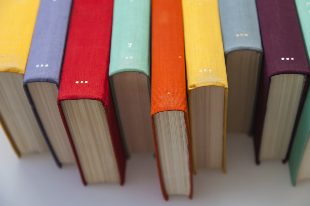
Let’s face it. We judge books by their covers.
I love old books with old leather binding and hand stitching. It wouldn’t matter if the story were utter dross, I’m a sucker for gorgeous worn out tomes.
And because it’s so beautiful to me, I might just check out what’s inside.
Just because you know your product is good, doesn’t mean customers are going to buy it. We are a world of Judgey McJudgersons.
So pandering is the name of the game. We want people to love your website so they buy your thing.
THE LOOK
So it’s got to look good. Good web design is simple and uncluttered.
Have a think about colour and colour combinations. Your landing page sets the scene for the rest of the website. It has to be concise and easy to read. You know how blue text on a red background can make you wig out? You don’t want that.
People don’t buy things if their eyes are bleeding by the time they find it.
Look at the design of websites you like and notice what their colour choices are. The key words here are harmony and contrast. Can you read it easily? Without conscious effort? Then that’s a good colour combo for a well-designed website.
Generally, white text on a darker background and black text on a lighter background are the heroes. But don’t be afraid to experiment and be creative. Readability is key, but you are not confined to black on white.
Try not to go crazy with the fonts, you’re not Quentin Tarantino: One for headings and one for content is sensible. Maybe a third if necessary, but that’s where I would cap it. It can start to look chaotic and confusing, and that is not a sensation you want to inspire in a potential customer.
When choosing your fonts, it is preferable for website design to go with a sans-serif font like Arial or Gothic. Serif fonts, like our favourite Times New Roman were primarily designed for print. Those little serifs are like guides for the eyes, making it easier to identify each letter and improve the flow of reading. Back in my school days we graphically dubbed them ‘eyeball hooks’.
But on screen, this is not the case. On screen text has a significantly lower resolution than print, which makes those serifs too cluttering for web. In general, sans serif fonts are the top choice for good website design.
NAVIGATION
Don’t send your traffic on a wild goose chase trying to find things. Keep it simple.
It might help to hand draw out your site map. How do you want people to travel through your website? It should be obvious where to go for the simplest of us. And that’s not to be condescending it’s to be inclusive: For your sake, as much as the customer’s.
I don’t want to solve a riddle or learn coding just to find your contact page.
Drawing a simple flow chart can help you visualize how people will navigate your website. You have a landing page – and from there you branch out. The titles you use for each web page need to be universal.
About Us. Blog. Contact. Pricing. Shop.
Don’t embellish. I should know immediately where I’m going when I click on an option. No guessing games.
Then there might be further options within your subpages. Within your Blog page you might have separate topics. I might want to read your blogs about interior design, but not about architecture. Having an additional dropdown menu or menu bar for each category would allow me to do that.
How you place this primary menu bar on your page is important. I should be able to see it straight away from your home page, without having to scroll looking for it.
I should be able to click straight through to what I’m looking for. Home > Products > Shopping Cart. On your subpages, ensure you identify to the user where they are. If they’ve clicked on Pricing, head that page with ‘Pricing’.
If I can access this same menu bar from anywhere on the site, that means I can go anywhere I want fast. I don’t want to return to the home page after I’ve entered the website just to find the menu again. Make that menu bar a staple on every page.
A website that is designed well makes it impossible to get lost.
EMAIL MARKETING INTEGRATION
No matter how awesome a website is, there’s going to be a percentage of your traffic that just isn’t ready to buy. But if your website is well designed, hope is not lost.
This is where email marketing is the perfect tool for bringing people back.
So I’ve found your site. It’s great and you sell what I want. But I just want to kick some tires for a while before I commit to a purchase.
But look here! You’ve got an awesome sign up page, where I can put in my name and email and keep up to date with what you’ve got going on. Commitment free!
I didn’t have to give you my credit card details, or commit to a free trial. It’s non-threatening and easy to unsubscribe if I want to.
And now that you have my details you can send me targeted marketing.
Perhaps I spent a bit of time on your page about custom design. Some great advertising on your custom products comes straight to my inbox.
Maybe you’ve got a weekly blog or article section? Every week I get your latest article. With your newsletters I’m kept up to date with the market, your products, and anything exciting you have coming up.
I might have visited half a dozen websites that day, but if yours is the only one I could sign up to easily, I’m never going to forget you.
Then when I’m ready to buy, it’ll be the first place I go. It’ll feel familiar and I already know you’ve got what I want.
THE END GAME
The end game is drawing traffic to your site. You want people to remember you and your product. If a customer doesn’t remember the fonts you used or how your site looked, that’s because they could click through without having to think.
That’s a win. That’s great website design.
Sure, after a while it’s going to be familiar and keeping it interesting is important. But interesting does not mean complicated.
If I need to give out navigational instructions like I’m directing cops to a crime scene, then you’ve gone too far. I need to be able to say ‘go to www.buythestuff.com, they have what you need.’ That’s it.
Put in the time to see what works and be proud of the website you design. This is your virtual personality.
No Comments yet!